2025-07-26
MSDGem Rebranding
Modern UI, Better Interactions, and a Fresh Visual Identity
2025-07-26
Modern UI, Better Interactions, and a Fresh Visual Identity
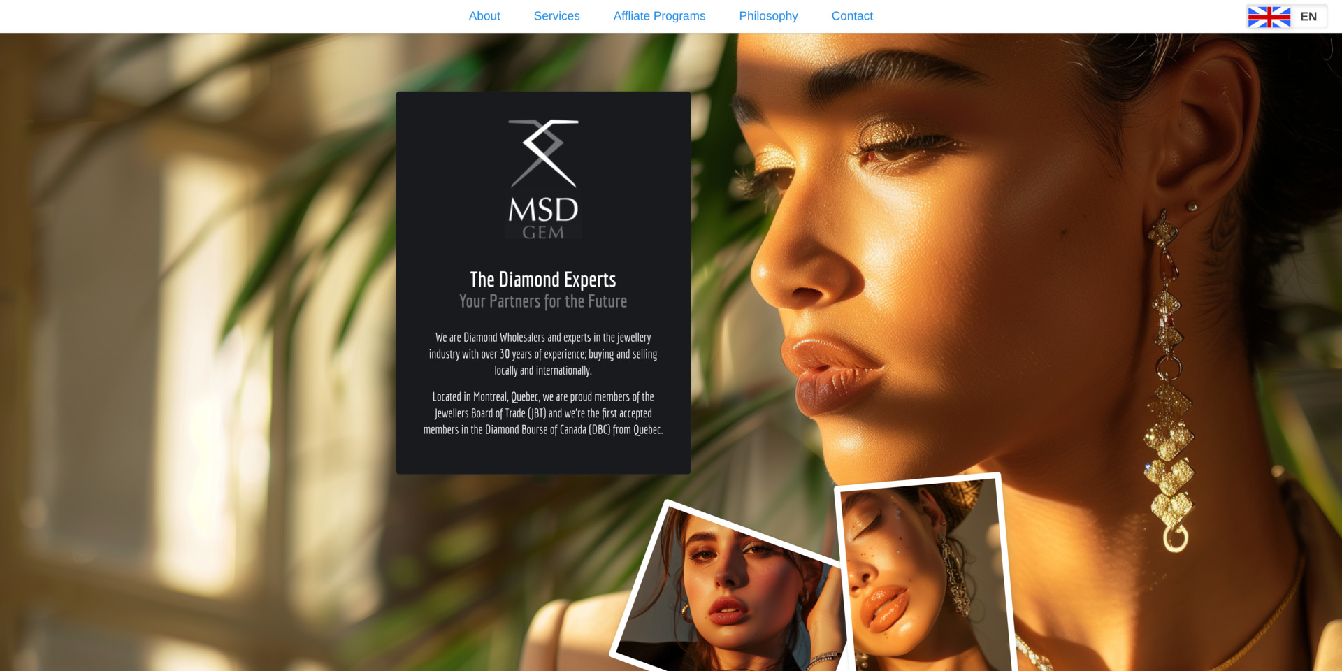
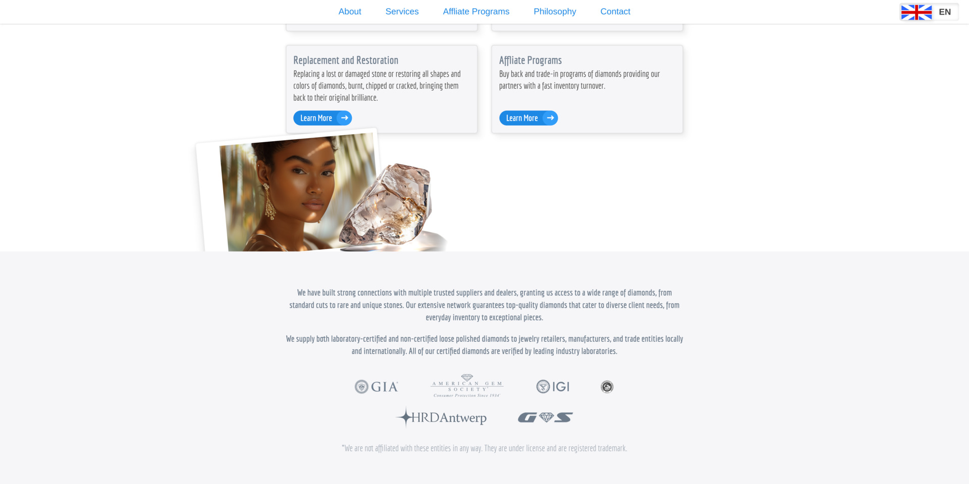
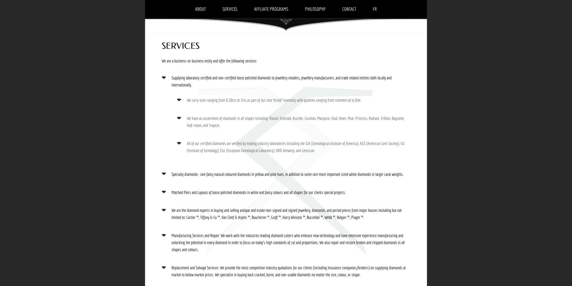
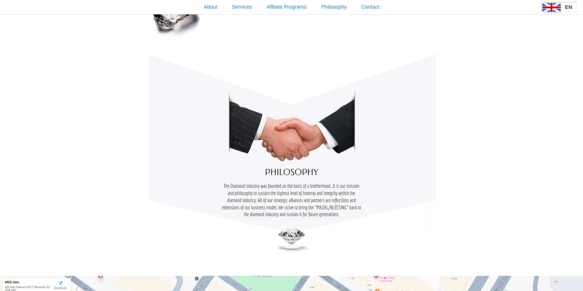
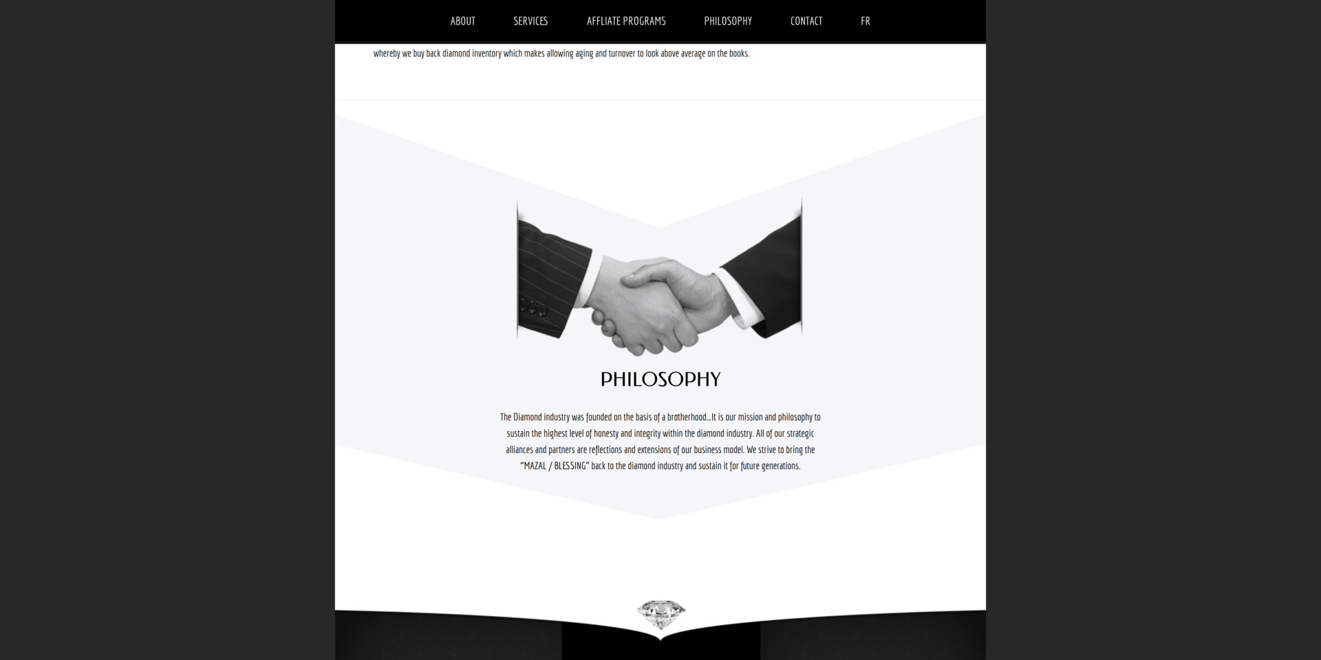
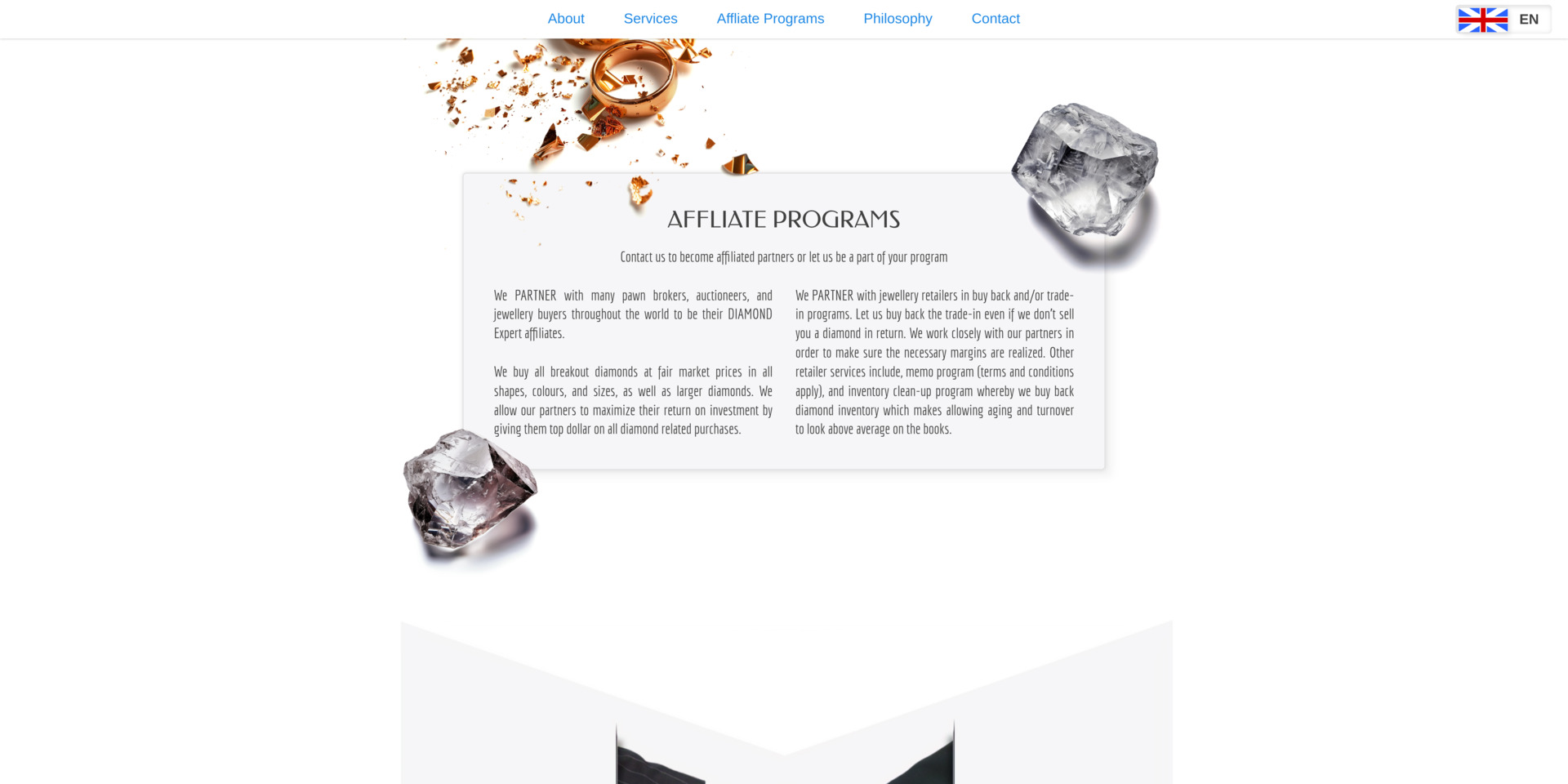
Reviving an outdated website isn’t just about adding new colors — it’s about reshaping how users feel, navigate, and interact with the interface. This project was a full transformation: modern visuals, smoother interactions, and a completely refreshed user experience.
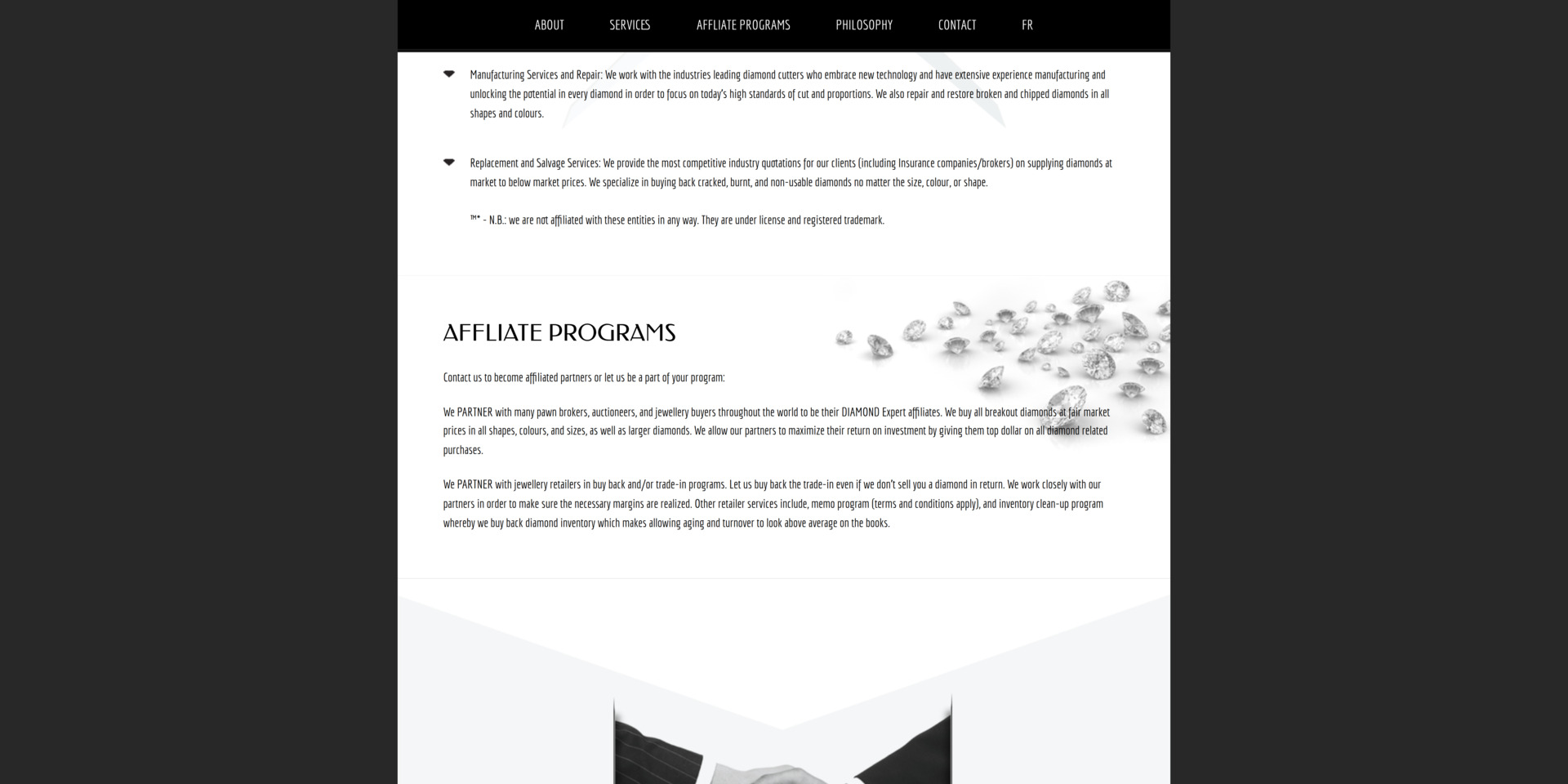
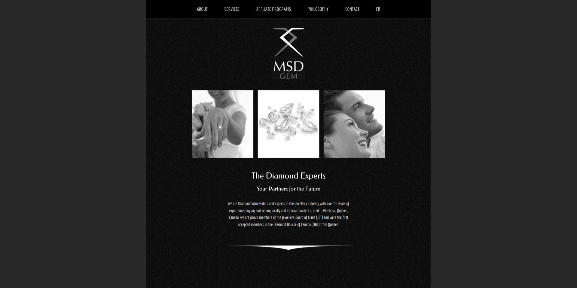
The original website had a flat, desaturated look. I rebuilt the visual layer with:
Together, these changes cleaned up the layout and made the whole site feel alive again.
Older sites often feel static. To fix that, I introduced:
Nothing flashy — just enough motion to guide users naturally.
I replaced outdated design elements with modern standards, such as:
Every component now feels intentional and consistent.
Beyond visuals, the website needed technical modernization. So I added:
These optimizations improved both the maintainability and performance of the site.
Decorative elements were updated to match today’s aesthetics:
Everything contributes to the overall mood without overwhelming the content.
The redesigned website now feels cleaner, faster, and far more intuitive. The refreshed color palette and modern components give it a vibrant, contemporary look, while optimized interactions and motion make the experience smoother and more engaging. With improved accessibility, better structure, and updated UI practices, the site is not only more pleasant for users but also significantly easier to maintain and evolve. Overall, the project transformed an outdated interface into a modern, living experience that aligns with today’s design and usability standards.